Redefining the Wait
Overview
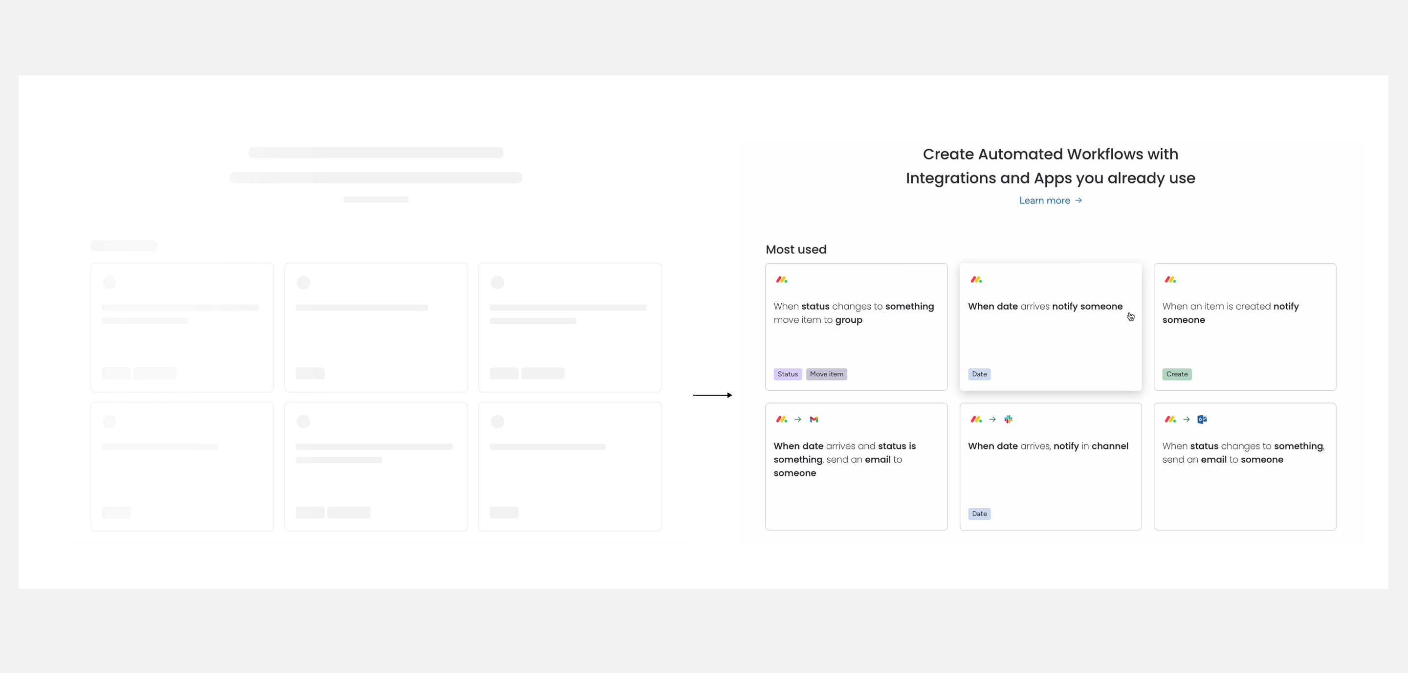
Every loader is a moment when users lose control. For years, monday.com's answer was a spinner. Sixteen different spinners, from sixteen different teams. I led the research and design initiative to replace that chaos with a single, coherent system: one that doesn't just reduce wait time, but reframes the wait entirely.
Role
Motion Design Team Lead
Lead Motion Designer & UX Researcher
THE PROBLEM
A “Hectic” Start
An audit of the platform revealed what I called “Hectic Flow”: 16 loading indicators across a single dashboard, 6 different types, zero shared logic. Every squad had solved the same problem in isolation. The result wasn't just inconsistent; it read as broken.
APPROACH
Ex: Dashboard “hectic” loading flow
- 16 loading indicator
- 6 different types
- no consistency message
THE STRATEGY
Research-Driven Motion
The solution wasn't to make spinners prettier. Research on perceived performance showed that loading isn't a speed problem. It's an information problem. Skeleton screens orient users before content arrives. We shifted our philosophy from “The Wait” to “The Preview.”
The Insight: 90% of users notice design quality during loading. 0% perceive skeleton screens as slow.
The Active Wait Test: We rebuilt the app entrance from a passive logo loop into a progressive, active build. In testing, 100% of users rated the new experience as faster, perceiving the 8-second load as roughly 4. Same performance, completely different feeling.
Ex 2: Welcome Screen to platform
Before
- Passive waiting was perceived as longer by 100% of testers.
- Logo loop: Lottie-driven DOM animation.
After
- Active waiting: progressing elements felt like ~4 seconds when the real load was 8.
- All motion, including the logo build, is authored in code.
OPERATIONALIZING
The System Library
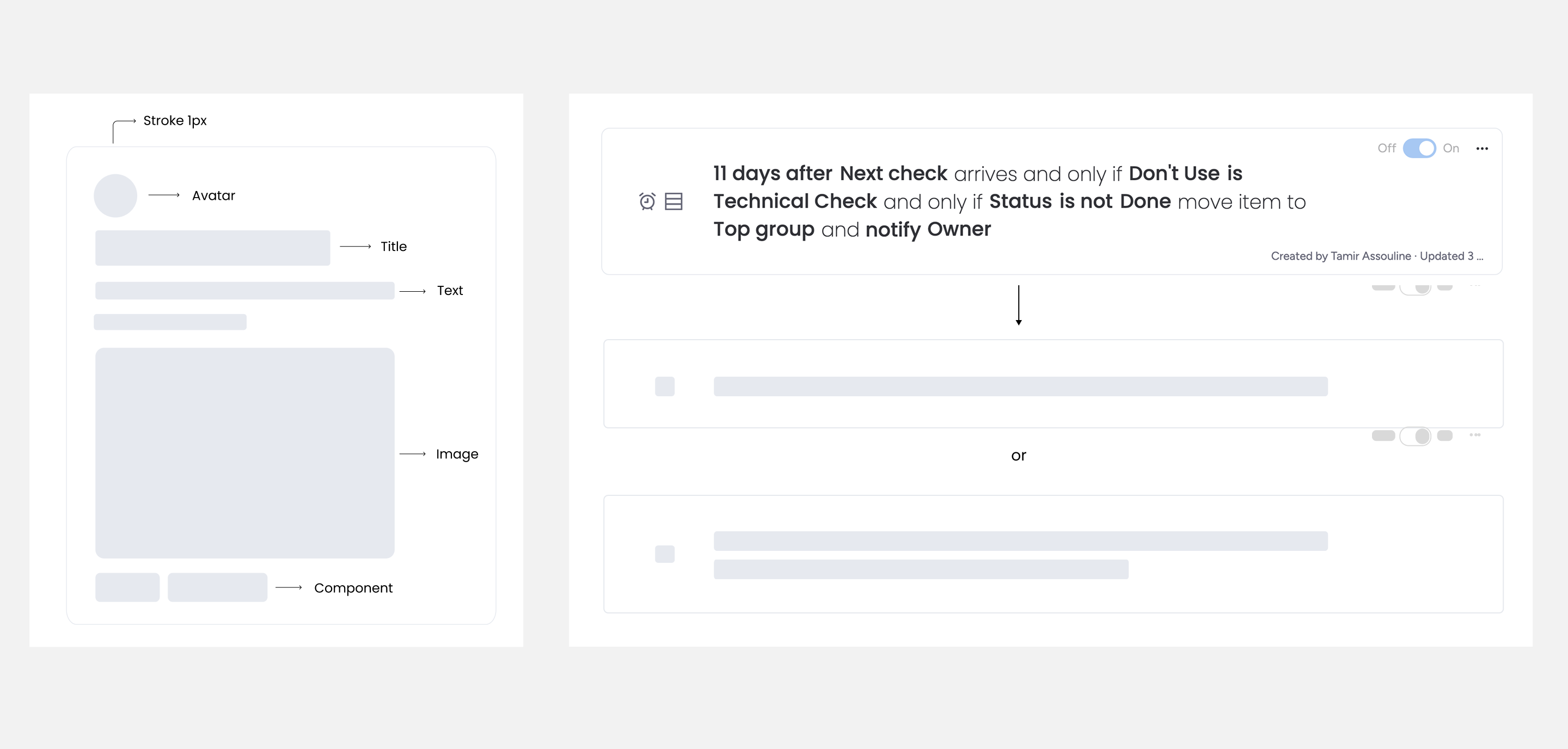
A good concept doesn't scale on its own. To ship consistent loading across 30+ product squads, I built a Loading Design System and Specs Library, documentation that made the right choice the easy choice.
The One-Loader Rule: One governing principle to prevent Hectic Flow from returning. One dominant loading treatment per surface, no exceptions.
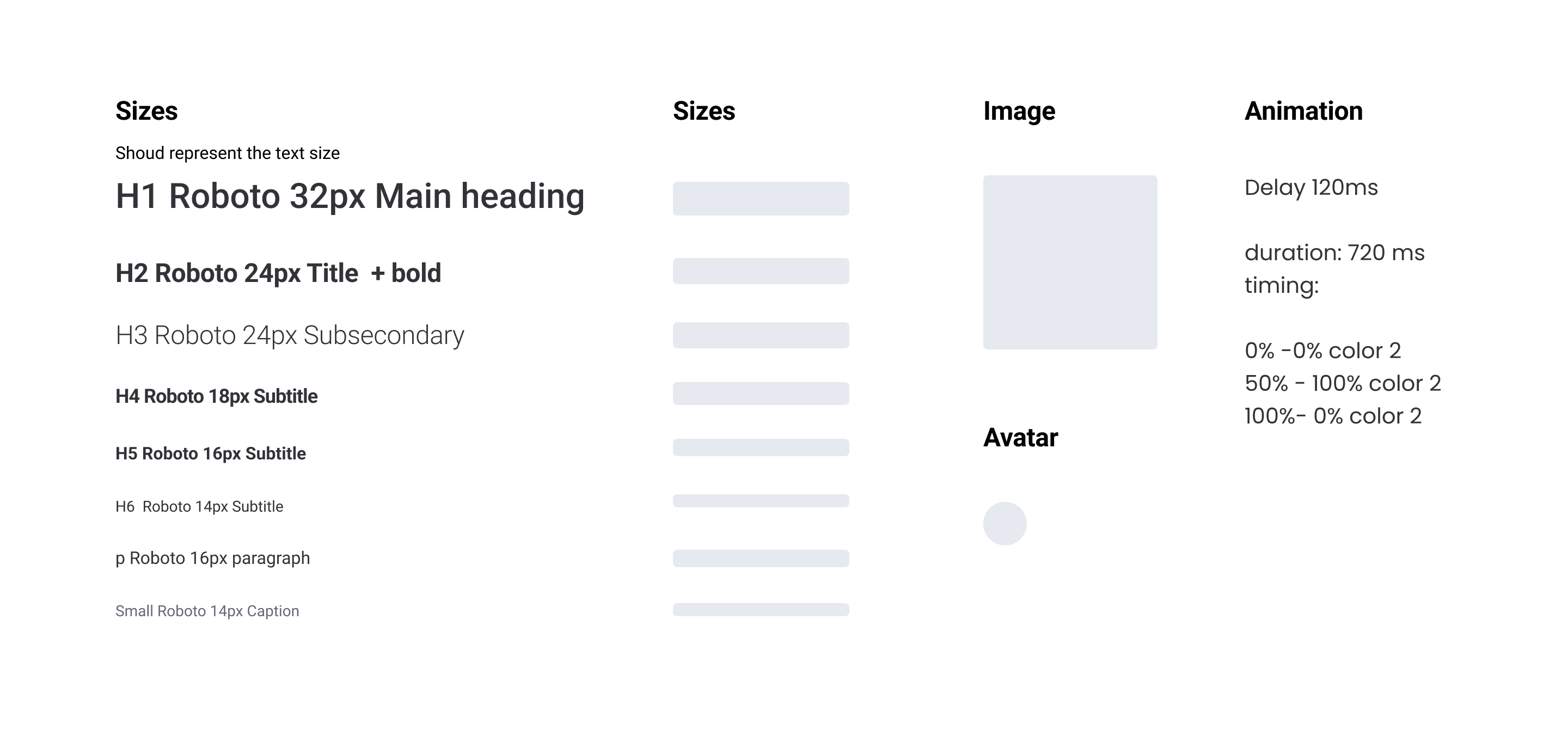
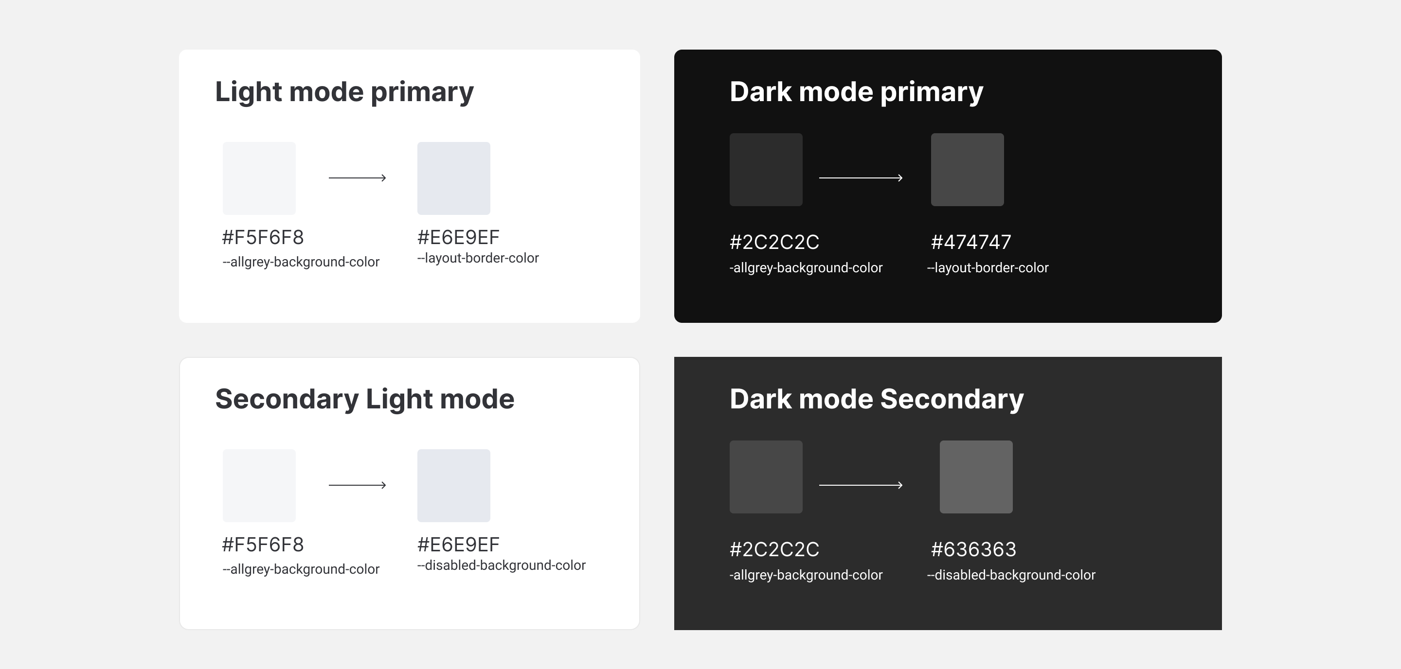
Motion Tokens: Shimmer duration (720ms), easing (cubic-bezier), color: all defined as shared tokens. What used to be solved case-by-case became a decision already made.
Realistic Layout
Component Design
Layout spec
Color tokens
Realistic Layout
Component Design
Layout spec
Color tokens
Realistic Layout
Component Design
Layout spec
Color tokens
EXTENDED STATES
Storytelling & Duration
The system handles most cases. But two specific load types needed something different.
Branded Narrative: A generic shimmer undersells high-value product moments. Across AI, Docs, Canvas, and more, we designed animated loops that visualize what the product is actually doing. The wait becomes part of the product story.
The Long Load (20s+): A shimmer held for 20 seconds reads as frozen. For heavy backend processes like exports and duplications, we designed progress-segmented loaders that communicate active work in phases, keeping users anchored rather than anxious.
Forms
Canvas
Docs
Sidekick
THE SEARCH-TO-EMPTY STATE
Continuity
Most loading systems stop at success. But what happens when the result is nothing? A hard cut from loader to empty state reads as failure. I designed the transition as a continuation. The loader flows directly into the empty state, maintaining visual momentum. The system doesn't fail; it resolves.
THE IMPACT
The Impact
The solution graduated from a focused prototype into the core design system, replacing ad-hoc loaders across thirty-plus squads. Along the way, the Active Wait study showed that perceived speed can move when the underlying load time does not.
Adopted across 30+ squads
The loading system was absorbed into the core design system and became the standard pattern across every product surface, replacing ad-hoc decisions with a shared language.
Perception over performance
The Active Wait test proved the principle in numbers: 100% of testers perceived the new entrance as faster. The real load time didn't change. The experience did.